Heckler Branding’s Tye Heckler speaks to 5THWAVE about the fundamentals of building successful coffee shop branding, and why the Starbucks logo remains such an influential design today
.jpg.aspx?lang=en-GB&width=700&height=471)
The iconic Starbucks siren as used by the brand today | All images courtesy of Starbucks Coffee Company
If a picture tells a thousand words, then an impactful logo should communicate a complex brand narrative in moments. For a coffee business seeking to build successful branding, the advice from Tye Heckler, owner of brand design agency, Heckler Branding, is simple: Find a compelling name and secure it with a trademark from the outset.
“It is fundamental; find a name that is unique, and trademark protect it from day one. Never worry about it again and move forward. It is far more painful and costly to conduct a name change after you’ve been operating versus getting it squared away from the start,” he says.
Heckler knows more than most on the subject of successful branding in the coffee industry. His company’s work includes developing brand identities for household-name hospitality businesses, including Starbucks, Cinnabon, Panera and Le Chatel, as well as having worked with technology giant Microsoft and Redhook Ale Brewery, to name but a few.
Once a brand name is set in stone, Heckler advises that coffee companies should review their branding around every ten years to evaluate how the brand can evolve in the context of market development. It’s a process that even the largest and most formidable brands of today have been through, and one from which lessons can still be learned at levels of the coffee industry today.
"It’s just amazing how coffee culture has proliferated over the past 50 years"
When Heckler Associates (now Heckler Branding) was established by Tye’s father, Terry, in 1969, one of the company’s first customers was a new premium coffee start-up based in Seattle’s Pike Market.
Wanting to base their coffee business on a nautical theme, the founders initially named the company ‘Pequod’ after Captain Ahab’s whaling ship in the novel Moby Dick. However, realising the name didn’t quite have the desired ring to it, they eventually settled on ‘Starbucks’ after the ship’s young chief mate on the advice of Terry Heckler.
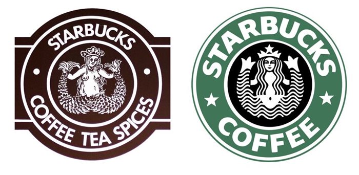
“The rest is history,” says Tye Heckler. “The original Starbucks logo design dates to 1971. It was a two-colour brown and white design solution, which Starbucks used for around 15 years.”
“There were several iterations over the years. In the late-1980s the logo was updated again. We made the siren symmetrical, and it was at this point the Starbucks green and black was introduced.”

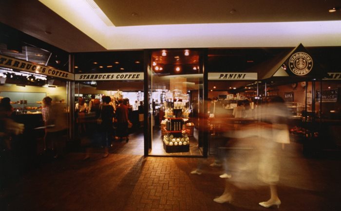
Starbucks store at the Columbia Centre, Seattle, 1989, with early branding
After completing college in 1992, Tye joined Heckler Associates and continued working with Starbucks under the guidance of Howard Schultz, who acquired Starbucks Coffee Company in 1987 and scaled the business to the international powerhouse known today.
Heckler Associates would go on to work with Starbucks until 2011, when the coffee chain’s most recent logo iteration was developed mostly in-house. But Heckler is clear that helping companies attain success, even when that means outgrowing the capacity of his own agency, remains his firm’s number one goal.
“We want our clients to grow fast, we want them to become big. It’s an honour to work with companies that become successful,” he says.
To achieve scaled success, Heckler is an advocate of using a modular branding approach combining instantly recognisable typeface and logo elements that can be used in tandem or independently. This methodology has been deployed by successful brands the world over, and enhances the scope for operational expansion, as well as widening opportunities for merchandising across a range of media – from coffee cups to t-shirts.
“For a long time, companies wanted to have an embedded name and logo, but most are better served by a trademark and a name joined in a design presentation that allows them to be separated. Like Starbucks today, the siren and the brand name can be pulled apart and do not have to be fully integrated.”
When it comes to product packaging design, Heckler has another central piece of branding wisdom for coffee businesses – “keep the experience fresh,” he says. Heckler explains that sales can be significantly improved by deploying unique branding to each coffee product instead of using uniform packaging – a recommendation his firm has made for retail coffee ranges launched by Starbucks, Cinnabon and Panera.
“People are often dedicated to their blend but after this change customers purchased other varieties, which translated to a dramatic increase in bean and beverage sales. We would then expand those designs to posters, table tents and other in-store merchandising tools, to promote the varieties on a monthly basis – thus always changing the look of the retail environment and keeping it looking new.”

Left: Starbucks' original logo desgined by Terry Heckler in 1971 | Right: The 1987 iteration
What’s in a name? It just goes to show that that when it comes to building successful branding, the answer is
everything. Once that central kernel of identity is in place, a flexible, modular approach to deploying logos and typeface can give fledging coffee brands the impactful start in life they need.
It’s an approach that has been tried and tested by some of the world’s most successful companies, and enabled them to not only become successful businesses, but important cultural influencers.
“In the 1970s, North America was far behind Europe when it came to coffee,” says Heckler. “It’s just amazing how coffee culture has proliferated over the past 50 years, and Starbucks has been a central player in that.”
This article was first published in Issue 7 of 5THWAVE magazine.
Subscribe to 5THWAVE to receive each edition in print and digitally or sign up to our newsletter and be the first to read the latest articles and updates on World Coffee Portal research
